The Project
Rebrand an established boutique content marketing agency
When initially hired by the agency, the existing name was "Mind Over Media". While the name had good intentions of representing a creative approach deeper than simple visuals, over time the clients began to refer to the brand as "MOM". While it may sound endearing to some, it was not the moniker we were looking to hold.
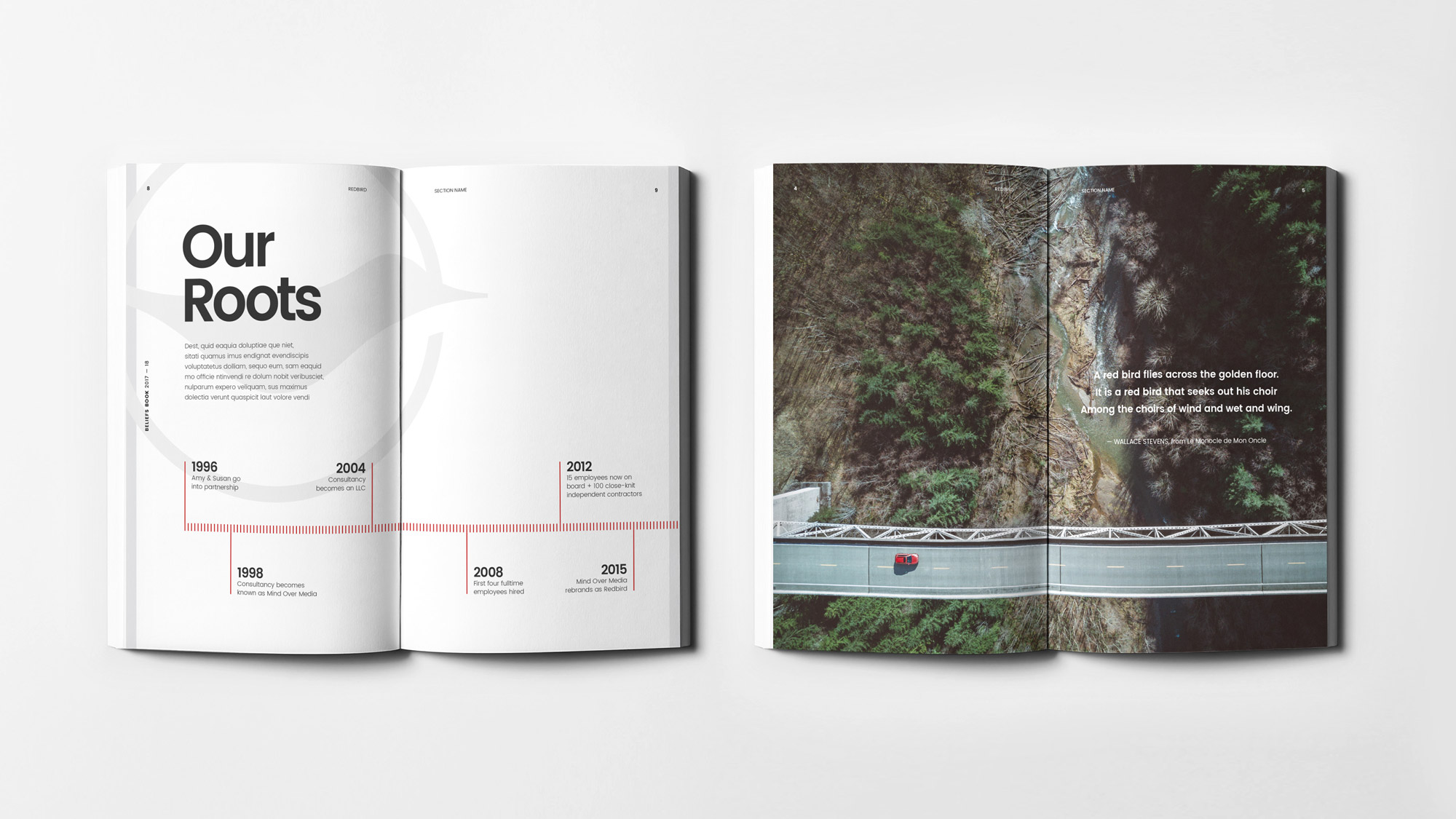
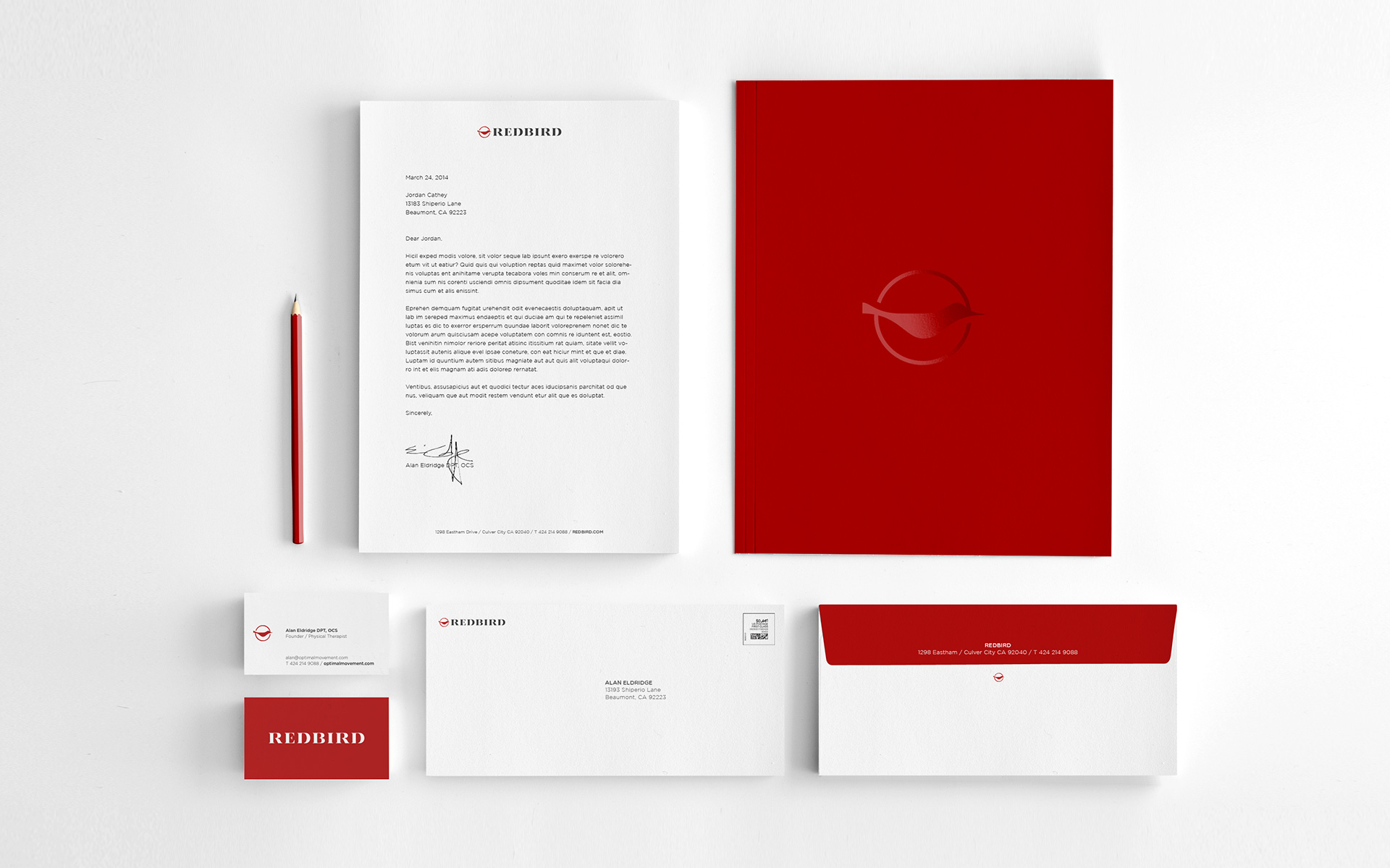
The founders had settled on rebranding with the name "Redbird", pulled from a Wallace Stevens poem, which refers to a redbird standing out amongst a tangled forest. Inspired by the brands roots in writing and journalism, I aimed to create a mark that brought a modern touch to classical serifed letterforms to establish both authority and prestige.
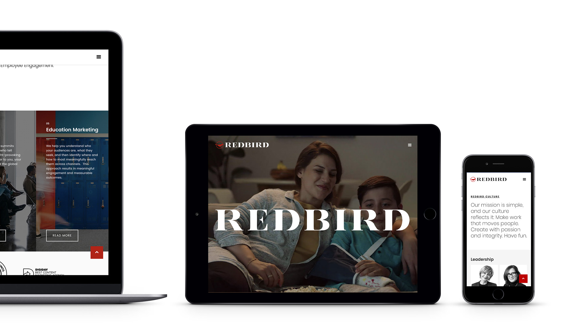
Over several years I designed and maintained the entire brand including all print collateral, sales tools, website, employee headshots, merchandise, motion graphics, social media and brand templates.
Client
Redbird Group
Year
2016 – 2020
Roles
Art Direction, Design, Photography & Digital


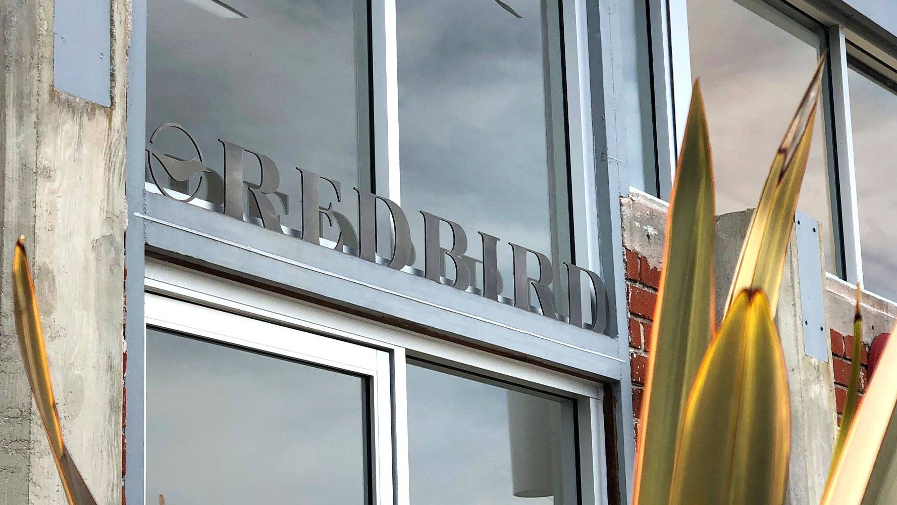
Physical Space
In addition to print and digital touchpoints, the Redbird brand was also manifested physically at the Culver City HQ. I designed, sourced fabrication and installed a custom steel laser cut above the entry to the office. Once inside, to bring life to a corridor I concepted, produced and installed a branded wall installation.
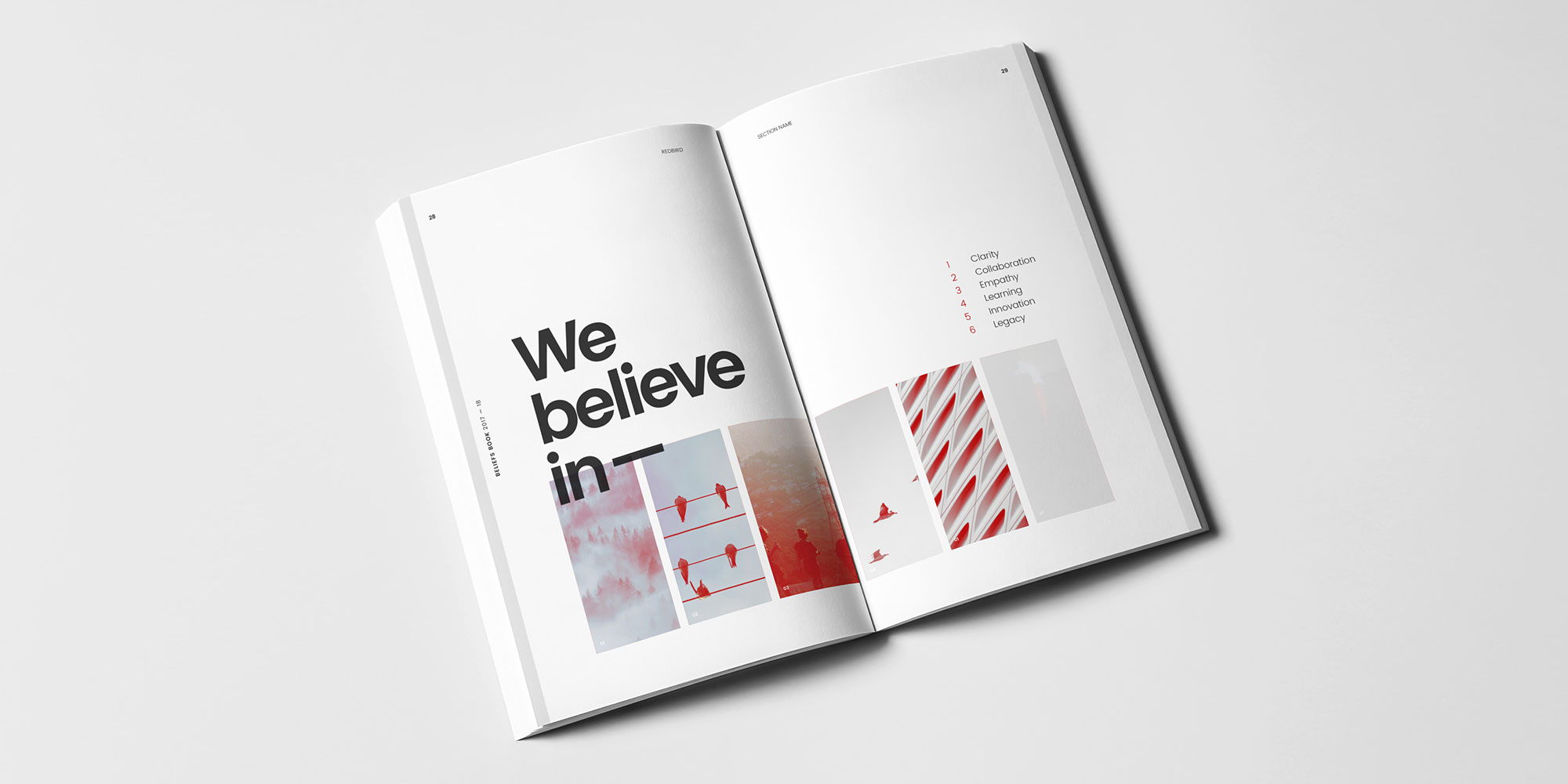
Beliefs Book
To solidify the Redbird brand both internally and externally, a 24-page perfect bound "Beliefs Book" was created. The book contained the core beliefs along with brief history/timeline of the brand and origin of the agency's name. Books were sourced from an online print on demand retailer for low initial cost and ease of restocking.